A2 Media Studies Horror Films.
Thursday, 7 March 2013
Question2: How effective is the combination of your main product and ancillary text?
For this question I have decided to make a podcast and quick short prezi.
Question3: What have you learnt from your audience feedback?
Here is a video me recording myself and talk about all the audience feedback I have received throughout my Media project.
We had shown our clips to two sixth form students and as you can see, they really enjoyed it they especially also really liked the music and the heartbeat.
The other half of the video is response from my media class. As media students, they are more aware of camera shots and how things are taken, of course their feedback will be more in depth. They all really liked the trailer and thought that improvements should be made, just like the other 2 students.
So far, I think my group and I have made a great start to the trailer and we will be improving it daily and showing updates on what we have improved.
Wednesday, 6 March 2013
Monday, 18 February 2013
Questionnaire
SLENDERMAN
A2 Horror project questionnaire
1. Was our poster successful in creating interest in our film?
2. Does our poster and trailer look professional?
3. Would you buy our magazine if you saw it in stores?
4. Does our trailer create any tension or feelings?
5. Do you understand the plot of our trailer?
6. Do you understand and see the link that our trailer, magazine and poster have?
7. By looking at the poster would you watch the movie in cinemas?
8. From watching the trailer, would you go to watch the film in cinema?
9. Was there any specific part of the trailer that made you jump/ frightened you?
10. What do you think about the special effects, sound edits in the trailer and were they effective?
11. Did the music and sound effects relate to the story line and horror genre?
12. Are there any comments or ways in which we can improve our products?
Thursday, 14 February 2013
Monday, 11 February 2013
Front cover positioning
Here is an update on the Front Cover magazine that my group and I have been working on. I believe we have added many conventions into the magazine and will be adding much more. We have asked for some feedback from teachers and students about positioning our text and where the final girl should be placed.
My original front cover was the top one and I had tried to move her to the side to see how it would work. Some students and teachers like the side on effect and some prefer it in the middle. Personally, I prefer it in the middle however, not everyone in my group agrees.
After long discussion about what will benefit us more, we had decided we will be sticking to keeping it in the middle as this is a common convention used in most magazines. The text will be wrapped around the final girl but not covering her face.
Sunday, 10 February 2013
Sharpening eyes
This shows how I sharpened the eyes on Photoshop. It was a simple process where I selected around the eye pupil using the shape-tool and clicked on filter and sharpen.
I found that this sharpened around the edges of the pupil, which instantly made it stand out and look more frightening.
I found that this sharpened around the edges of the pupil, which instantly made it stand out and look more frightening.
Saturday, 9 February 2013
lionsgate trailer opening
We chose to use Lionsgate as the production company for our trailer, as we have noticed that a lot of horror films with a similar target audience as ours use Lionsgate. We used the Lionsgate logo at the beginning of our trailer but edited it to make it better suit the horror genre.
Friday, 8 February 2013
Poster Sci Fi effect
I have included the '18' logo on the bottom left of the poster to show that the film is an 18 rated film by the BBFC which stands for British Board of Film Classification. This is done as it shows professionalism within my poster and what sort of film it is.
Also, I have added a 'Lionsgate' sponsor on the bottom right which is seen on many films by Lionsgate. I did this because not only is it professional but, Lionsgate is recognised internationally and allows my poster to seem like a big upcoming film that will have its own premieres and interviews and would be all over tv adverts and news.
Tuesday, 5 February 2013
Filtering and adjusting colours of poster
Karwin and I been working on the poster for a few days and we have been adjusting different colours and filters to the original image which is a picture of the final girl's eye. Below is the picture.
Karwin and I chose to use this picture as we believe it shows fear. We have discussed this with our group and we all agree that once it had been manipulated on Photoshop, it would look even scarier and relate to the film.
Monday, 4 February 2013
Airbrushing Poster
The top poster has been airbrushed to get rid of any unwanted attention on the picture of the final girl's eye. The eyebrow had tiny little hairs that we felt got in the way of the poster so that was removed by using the airbrush tool. We also felt that dots of mascara spread around her eye was taking away the attention, too.
I feel that including small details like this is really effective as I believe that small things could make a big change to our final outcome.
Friday, 1 February 2013
Static Effect
Wednesday, 30 January 2013
Front Cover Editing.
The front cover above was done by Mahek me. Whilst Cleo and karwin were working on the trailer editing. The conventions have been met and has started to look like a magazine. An interesting thing I like about this is the film reel at the bottom to show upcoming movies and also a link in with the 'PLUS' and the movies below it. I had put in some input with the 'NO' spread all over effect and the Slenderman logo in the middle below the final girl.
Below is a another front cover magazine Mahek and I had refined through the old one above. As you can see there are drastic improvements and changes that have been made.
In this final print screen, is the most up to date one that I have done. It includes a colour change in the Slenderman logo to make it easier for the audience to guess what film it is, if they do not know. Fonts have been changed, but not all of them yet. I will be working into this.
Tuesday, 29 January 2013
Static Front cover .
Wednesday, 23 January 2013
Front cover editing.

The front cover was done by me and Mahek. Whilst Cleo and Karwin were working on the trailer editing it and adding final touches. The conventions that have been met and has started to look like film magazine. The thing I lie in the magazine is the film reel at the bottom to show upcoming movies and also a link in with the 'PLUS' and the movies below it. I had put in some input with the 'NO' spread all over effect and the Slenderman logo in the middle below the final girl but the 'NO's are a bit too much.
Below is a another front cover magazine me and Mahek refined through the old one above. As you can see there are big improvements and changes that have been made.

As you can see, the film reel has been changed from white to black as I thought it would look better and more realistic. The link between the 'PLUS' and the reel has more of a connection. A better barcode has been added as the previous one was really blurry. I have changed the date to 2013. We have also changed the picture of the final girl as we feel that the old one was poor and cut outs were bad as this reduces the quality of the magazine.

In this final print screen, is the most up to date one that I have done. It includes a colour change in the Slenderman logo to make it easier for the audience to guess what film it is, if they do not know. Fonts have been changed, but not all of them yet.
Monday, 21 January 2013
Slenderman Poster Ideas.
I have created slenderman titles for our poster and the idea was to create the logo in such a way that it could seem like it is a part of a forest. I have distorted a font on Photoshop and paint to make the words more twig like and we also had an idea of maybe making slenderman raise his long arms into the text so it looks like it is part of him.
Sunday, 20 January 2013
Audience Feedback.
We had shown our clips to two sixth form students and as you can see, they really enjoyed it they especially also really liked the music and the heartbeat.
The other half of the video is response from my media class. As media students, they are more aware of camera shots and how things are taken, of course their feedback will be more in depth. They all really liked the trailer and thought that improvements should be made, just like the other 2 students.
So far, I think my group and I have made a great start to the trailer and we will be improving it daily and showing updates on what we have improved.
Saturday, 19 January 2013
Rough Cut 1. A2 Media Studies
This is the rough cut that Karwin mainly made which includes a lot more scenes of the teenagers breaking into houses and wondering around and running. We really liked it and we all agreed that if this were to be merged with Cleo's rough cut, our final trailer will be outstanding. Personally I think that so far, the trailer is good. I had learnt that the green screen 'R' rated part would need to be changed as it is American. Much more needs to be edited at the end of this clip as. A reason why the end is still unedited is because the filters where just a test to see which was more effective, filter or no filter. The filter Karwin used was the 'Sci-Fi' filter as long as changing the brightness, saturation and contrast of the picture.
Thursday, 17 January 2013
Wednesday, 16 January 2013
Rough Cut.
This is the first rough cut we have edited. We have used various shots, tried to create a scary horror tension and atmosphere.
Tuesday, 15 January 2013
Editing Slenderman For Poster.


This is the process of how Karwin had made our initial poster. We as a group have been taking pictures and the picture which Karwin used to edit was taken by me. The image is of the man was a business man from an iStock image and Karwin had taken the outline of it and transformed it into a longer and slimmer body shape which resembles Slenderman. Karwin then placed him behind a tree in which resembles to what images of slenderman is like on the internet. To put him behind the tree, Karwin cut and paste the section of the tree so he can be hidden behind it. Further adjustments will be added of different designs for a final refined poster.
Monday, 14 January 2013
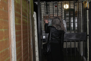
Trapped
I took these pictures when I was in tooting. It was really dark and these gates I saw loo really creepy and it kind of reminded me of our trailer Narrative. Slender man chasing the victims and they finding themselves trapped. So I thought I could take pictures of my friend trying to get away from Slendeman.
Extreme close up shot of the gates so that the images could create tension and so that we could we trapped ourselves.
Sunday, 13 January 2013
Analysing Magazine Covers.
Conventions of front cover magazines;
- masthead
- pull quote
- cover lines
- teasers
- buttons
- bleed outs
- bar code & price
- one main image
Friday, 11 January 2013
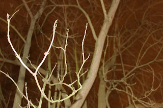
Tooting Park (Trees)
Thursday, 10 January 2013
Magazine Front cover.
Here are the ideas that me and my group came up with for our magazine cover.
We will use the Total Film instead of Empire
Using a glow-up masthead because it relates to the image, where the final girl will be holding a torch)
The website & issue number on top of the 'M' of 'FILM'
Main image. of final girl in foreground, and Slender Man hiding in the back
barcode on bottom right corner
We may add a spin.

Here is our flat-plan which Mehek drew, so that we had an understanding of what our magazine will look like.

Karwin added the conventions of 'Total Film' magazine such as the barcode puffs, plus signs bleed outs pull quotes and title of film. We still need to consider which one we want to use.
We will use the Total Film instead of Empire
Using a glow-up masthead because it relates to the image, where the final girl will be holding a torch)
The website & issue number on top of the 'M' of 'FILM'
Main image. of final girl in foreground, and Slender Man hiding in the back
barcode on bottom right corner
We may add a spin.

Here is our flat-plan which Mehek drew, so that we had an understanding of what our magazine will look like.

Karwin added the conventions of 'Total Film' magazine such as the barcode puffs, plus signs bleed outs pull quotes and title of film. We still need to consider which one we want to use.
Wednesday, 9 January 2013
Photos of filming location.
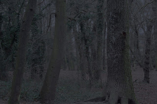
Biggin Woods
These are the photos Cleo took in Biggin Woods. Mostly of trees which she may edit Slenderman into. She took pictures of paths and stairs in the woods.The pictures are very dark and creepy, we wanted to make the pictures are freaky as possible so they would create tension in their own way.
Subscribe to:
Comments (Atom)


.jpg)


.jpg)


